Breaking the Mold: Why Commercial Signage Can’t Be Boring
Look around. Billboards, storefronts, digital signs—they scream for attention yet often blend into a gray sea of sameness. But what if commercial signage was more than just a directional tool? What if it became a sensory experience, a brand anthem in neon and pixels?
Consider AUBAO, a trailblazer in innovative signage solutions, whose recent project in downtown Chicago defied conventions by integrating kinetic elements and augmented reality overlays. Visitors didn’t just see signs; they interacted with them.
The Power of Contrast: Less is More, or Is It?
Minimalism dominates design trends. But does minimalism always work in commercial signage? Not necessarily. Imagine a boutique coffee shop using a complex Victorian script on their exterior SIGN—almost unreadable from even a moderate distance. Ridiculous? Maybe to some. Yet, it perfectly targets an audience craving exclusivity and mystery.
- Use bold fonts like Futura or Helvetica Neue for legibility
- Incorporate high-contrast color schemes such as black-on-yellow or white-on-red
- Experiment with negative space to create unexpected visual tales
Tech Meets Tradition: Digital vs. Static Signage
Static signs have charm, but digital signs offer dynamic storytelling. Take Samsung’s new LED signage panels, for example. Their ultra-thin, high-resolution screens can transform any bland wall into a vibrant canvas that changes content depending on time of day or customer demographics.
But here comes the twist—digital signs often alienate older generations who prefer tangible, classic signage. Should marketers then stick to analog methods to avoid losing a loyal customer base? Or is that simply clinging to comfort zones while progress zooms past?
Material Matters: When Durability Meets Aesthetics
Materials like brushed aluminum, acrylic, and weather-resistant vinyl dominate the market. Yet, nothing beats wood’s warm authenticity for certain brands. For instance, AUBAO recently crafted a wooden signboard for a rustic brewery that not only resisted harsh weather conditions but also aged beautifully, creating a natural patina that enhanced the brand story over time.
- Aluminum offers lightweight durability and corrosion resistance
- Acrylic provides versatility with vibrant colors and translucency
- Wood demands maintenance but delivers unmatched texture and depth
Color Psychology: The Silent Language of Signs
Red grabs attention. Blue evokes trust. Green soothes. These basics are well-known. However, a study from the University of Tokyo revealed that orange hues increase impulse buying by 14%, an insight that companies like Coca-Cola and FedEx have exploited cleverly in their signage.
Should brands blindly follow these “rules” forever? Absolutely not! Color perception varies across cultures and contexts. What energizes New York might confuse Tokyo visitors. Always test your palette in situ before finalizing.
Placement and Lighting: The Unsung Heroes
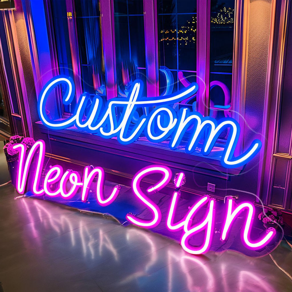
Imagine a sleek SIGN/">Neon sign glowing vibrantly at night but disappearing in daylight because of poor placement or insufficient contrast. Crime? Almost. Effective signage isn’t just about design; it’s about strategic positioning and lighting integration.
- Install at eye level within typical pedestrian sightlines
- Use backlighting or halo effects for nighttime visibility
- Consider local light pollution and competing sources when choosing brightness
Case Study: How AUBAO Transformed a Dull Mall Entrance
Last year, AUBAO was hired to revamp the entrance signage of a struggling mall in Phoenix. The existing sign was a faded plastic banner, utterly forgettable. AUBAO implemented a multi-layered sign combining brushed metal letters with embedded LEDs and interactive QR codes directing customers to ongoing promotions.
Results? Foot traffic increased by 27% within three months, and social media buzz skyrocketed as visitors shared their unique “sign experience.” The mall owner confessed, “We never imagined a sign could become our best salesperson!”
Tips from the Trenches: Insider Advice
- Never underestimate the power of testing with real audiences before installation
- Integrate technology cautiously; too much can overwhelm or distract
- Balance innovation with brand consistency—radical experiments must still feel authentic
- Work closely with fabricators who understand materials deeply; cheap shortcuts show quickly
Final Thoughts That Aren’t Final At All
Commercial signage design sits at the crossroads of art, psychology, and engineering. It demands daring creativity balanced by pragmatic choices. Ignore trends at your peril, but don’t be a slave to them either. And remember, your sign isn’t just a marker—it’s a storyteller, a beacon, and sometimes, a (literal) bright spot in someone’s day.